Archive for August, 2006
XBAP Not Serving Up Correctly
Tuesday, August 29th, 2006I have been made aware that the xbap examples are not being served up correctly. I am looking into this and should have it resolved soon.
[UPDATE] It seems that the MIME types required to serve the XBAP did not register right away, even though they were added to the configuration files. Everything should work correctly now.
If anyone has any other issues please let me know.
-MGE
SmileyButton Source Code
Tuesday, August 29th, 2006Here is the XAML source code for the SmileyButton control templating xbap example which I showed in my previous post.
-
<Grid
-
xmlns="<a href="http://schemas.microsoft.com/winfx/2006/xaml/presentation">http://schemas.microsoft.com/winfx/2006/xaml/presentation</a>"
-
xmlns:x="<a href="http://schemas.microsoft.com/winfx/2006/xaml">http://schemas.microsoft.com/winfx/2006/xaml</a>"
-
xmlns:mc="<a href="http://schemas.openxmlformats.org/markup-compatibility/2006">http://schemas.openxmlformats.org/markup-compatibility/2006</a>"
-
xmlns:d="<a href="http://schemas.microsoft.com/expression/interactivedesigner/2006">http://schemas.microsoft.com/expression/interactivedesigner/2006</a>"
-
mc:Ignorable="d"
-
Background="#FFFFFFFF"
-
x:Name="DocumentRoot"
-
x:Class="SmileyButton.Scene1"
-
Width="200" Height="200">
-
-
<Grid.ColumnDefinitions>
-
<ColumnDefinition Width="*" />
-
</Grid.ColumnDefinitions>
-
<Grid.RowDefinitions>
-
<RowDefinition Height="*"/>
-
</Grid.RowDefinitions>
-
-
<Button x:Name="SmileyButton">
-
<Button.Template>
-
<ControlTemplate TargetType="{x:Type Button}">
-
<Grid x:Name="Grid" ShowGridLines="false">
-
<Grid.ColumnDefinitions>
-
<ColumnDefinition Width="*" />
-
<ColumnDefinition Width="*" />
-
<ColumnDefinition Width="*" />
-
</Grid.ColumnDefinitions>
-
<Grid.RowDefinitions>
-
<RowDefinition Height="*"/>
-
<RowDefinition Height="*"/>
-
<RowDefinition Height="*"/>
-
</Grid.RowDefinitions>
-
<Image x:Name="Image" Source="middle_smiley.png" Grid.ColumnSpan="3" Grid.RowSpan="3" />
-
-
<Rectangle x:Name="TopLeft" Grid.Column="0" Grid.Row="0" Fill="#0FFFFFFF" />
-
<Rectangle x:Name="Top" Grid.Column="1" Grid.Row="0" Margin="0,0,0,0" Fill="#0FFFFFFF"/>
-
<Rectangle x:Name="TopRight" Grid.Column="2" Grid.Row="0" Margin="0,0,0,0" Fill="#0FFFFFFF"/>
-
-
<Rectangle x:Name="MiddleLeft" Grid.Column="0" Grid.Row="1" Margin="0,0,0,0" Fill="#0FFFFFFF"/>
-
<Rectangle x:Name="Middle" Grid.Column="1" Grid.Row="1" Margin="0,0,0,0" Fill="#0FFFFFFF"/>
-
<Rectangle x:Name="MiddleRight" Grid.Column="2" Grid.Row="1" Margin="0,0,0,0" Fill="#0FFFFFFF"/>
-
-
<Rectangle x:Name="BottomLeft" Grid.Column="0" Grid.Row="2" Margin="0,0,0,0" Fill="#0FFFFFFF"/>
-
<Rectangle x:Name="Bottom" Grid.Column="1" Grid.Row="2" Margin="0,0,0,0" Fill="#0FFFFFFF"/>
-
<Rectangle x:Name="BottomRight" Grid.Column="2" Grid.Row="2" Margin="0,0,0,0" Fill="#0FFFFFFF"/>
-
</Grid>
-
<ControlTemplate.Triggers>
-
<Trigger Property="IsPressed" Value="True">
-
<Setter TargetName="Image" Property="Source" Value="surprised_smiley.png"/>
-
</Trigger>
-
<Trigger SourceName="TopLeft" Property="IsMouseOver" Value="true">
-
<Setter TargetName="Image" Property="Source" Value="topleft_smiley.png"/>
-
</Trigger>
-
<Trigger SourceName="Top" Property="IsMouseOver" Value="true">
-
<Setter TargetName="Image" Property="Source" Value="top_smiley.png"/>
-
</Trigger>
-
<Trigger SourceName="TopRight" Property="IsMouseOver" Value="true">
-
<Setter TargetName="Image" Property="Source" Value="topright_smiley.png"/>
-
</Trigger>
-
<Trigger SourceName="MiddleLeft" Property="IsMouseOver" Value="true">
-
<Setter TargetName="Image" Property="Source" Value="middleleft_smiley.png"/>
-
</Trigger>
-
<Trigger SourceName="Middle" Property="IsMouseOver" Value="true">
-
<Setter TargetName="Image" Property="Source" Value="middle_smiley.png"/>
-
</Trigger>
-
<Trigger SourceName="MiddleRight" Property="IsMouseOver" Value="true">
-
<Setter TargetName="Image" Property="Source" Value="middleright_smiley.png"/>
-
</Trigger>
-
<Trigger SourceName="BottomLeft" Property="IsMouseOver" Value="true">
-
<Setter TargetName="Image" Property="Source" Value="bottomleft_smiley.png"/>
-
</Trigger>
-
<Trigger SourceName="Bottom" Property="IsMouseOver" Value="true">
-
<Setter TargetName="Image" Property="Source" Value="bottom_smiley.png"/>
-
</Trigger>
-
<Trigger SourceName="BottomRight" Property="IsMouseOver" Value="true">
-
<Setter TargetName="Image" Property="Source" Value="bottomright_smiley.png"/>
-
</Trigger>
-
-
</ControlTemplate.Triggers>
-
-
</ControlTemplate>
-
</Button.Template>
-
</Button>
-
</Grid>
Control Templating: One of the Most Powerful WPF Features! (KevinButton example)
Monday, August 28th, 2006A few weeks ago there was a good humored Channel 9 video named "Reskin Your Application with the KevinButton". While the video is lighthearted, it makes a very important point: Control templates are one of the most powerful and important reasons why we should all look at WPF as our future development platform. I've had discussions with many people who are just starting to look seriously at WPF. Their initial response to the new platform is very similar and can be summed up by, "WPF has some cool features and nice eye-candy, but I don't find it particularly ground-breaking." Invariably these same people completely reconsider their initial impressions once they "get" what control templates are all about.
To get an understanding of exactly why control templates are so powerful you need to know that, with a very few exceptions, in WPF controls do not own their presentation. The presentation of a control is almost completely separated from the business logic of that control. By using a control template the presentation can be overridden to be almost anything.
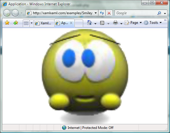
In the Channel 9 video, Kevin Moore and Robby Ingebretsen create a new button template that animates a button using a grid, some rectangles and a few images. Check out the video. I was unable to find the source code for their example so I quickly created a similar SmileyButton xbap example for everyone to peruse. Just click on the picture below to run the xbap app. This does exactly the same thing as the KevinButton, but using different images. The smiley will animate according to which part of the button the mouse is over. This has been built using the July CTP.
If you haven't had a chance to watch the video, the important thing to note about this example is that the single control in the application is a button: it captures and hooks into all the events and methods that a standard button inherits. It just has its presentation changed to be something other than the default.
The xaml source code for this WPF example can be found in the next post.
Transparent Application Window in WPF
Wednesday, August 16th, 2006I still see lots of questions on how to make a main application window transparent or semi-transparent. This was a bit involved in versions of WPF previous to the June CTP and was not very practical because it could not be rendered in hardware. But functionality added to WPF since has made it easy to accomplish and it supports hardware rendering when available. All you need to do is to base your main scene on the Window class and add the following code to the constructor:
this.WindowStyle = WindowStyle.None;
this.AllowsTransparency = true;
this.Background = new SolidColorBrush(System.Windows.Media.Color.FromArgb(0, 34, 34, 34));
Note that the amount of transparency, or more correctly, opaqueness, is set by the alpha channel which is the first number in the FromArgb method. Setting the alpha channel to 1.0 would be 100% opaque. 0 is 0% opaque and .5 is 50% opaque.
-MGE
Work In Progress: Nokia N80 Review Application
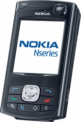
Monday, August 14th, 2006 I am currently looking at ideas for how text can be incorporated into an application in interesting ways by incorporating 3D surfaces. My proof-of-concept will be an xbap application which gives a hands-on review of the features of the Nokia N80 phone. My initial idea is to have a 3D representation of the phone which can be rotated. As the point-of-view of the phone changes documents related to the currently viewed face of the phone will rotate onto the viewing surface.
This is currently in the planning stages; I should have something to show in the next few days.
�
PostItBoard Source Code
Monday, August 14th, 2006PostItBoard Example
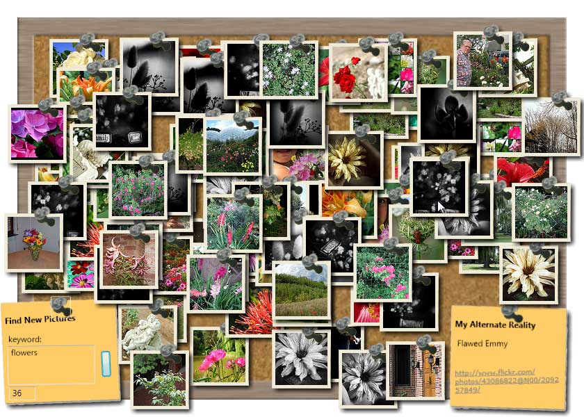
Monday, August 7th, 2006In my previous post I promised I'd get you a working copy of the example app. It can be found here. This is just the executable as I am cleaning up the code for the project to make it somewhat more presentable. This demo is made for the July CTP of .NET Framework 3.0. Above you can see a screenshot of the example with around 80 pics sitting on the corkboard...click the pic for a larger version.
You may notice that the details postit is no longer skewed as it was before. This is because there doesn't seem to be a way to base the orientation of the InkCanvas recogition to the application window. Instead it attempts to recognize gestures in whichever�orientation it happens to be in. This is a good thing, in general, but for this example it made recognition rather difficult since you are forced to skew your gestures to match the skew of the PostIt. Probably not a big deal with a TabletPC and a stylus, but a pain with a mouse.
It will run on Windows XP, but unless you have the Microsoft Windows XP Tablet PC Edition 2005 Recognizer Pack it won't recognize any gestures (note: this can be installed on any XP operating system, not just the Tablet PC edition). Recognition is built-in to Widows Vista.
Sorry folks, no XBAP edition of this app. Although I generally want to release an XBAP version of each bit so you can see it online without having to download it, getting a browser enabled version of this one up-and-running would be more trouble than it's worth.
-MGE
Unique Interfaces in WPF/XAML: PostIt Board Example
Friday, August 4th, 2006See the image above? That's an actual screenshot of the PostItBoard WPF example I've been working on. This application attempts to make good use of a non-standard interfaces to provide a rich UX (user experience). It takes a keyword(s), grabs images off of Flickr.com which match those keywords, and displays the photos on the cork board. The images can be moved around the cork board and additional layers of images can be added/removed. As you move your mouse over an image, information on that photo is displayed on the post-it note.
One aspect I focused on for this app is to minimize my input interface while maximizing functionality. I was discussing this with my colleague, Beth Massi, the other day and she suggested using gestures. Great idea! While gestures and gesture recognition is typically the domain of tablet pcs, they are appearing more often in apps made for non-tablets too. To integrate gesture recognition I overlayed an InkCanvas onto the details PostIt note and bubbled up the recognized gestures to the main window. So, if you have 3 layers of images on your cork board you can discard the top layer by issuing a down chevron gesture on the details PostIt with your mouse or a stylus. To clear all photos, make an O gesture. To increase/decrease the size of all the images make a greater-than/less-than gestures. To increase/decrease the number of photos pulled per layer use up/down gestures. Gestures seem to be an effective way to add functionality without having to add interface elements.
Also of note is that the app uses a transparent window, which allows post-its and pics to hang off the edge of the cork board. While this looks visually compelling, I'm not sure the additional CPU requirements would justify the use of a transparent window in this type of app in a production environment.
From a GUI design point-of-view things are pretty straightforward. I've created three custom usercontrols: SnapShot, SnapShotQuery, and SnapShotDetails. The SnapShot control takes care of displaying pics and storing information about those pics. The SnapShotQuery gathers information on the type of pics you want to see and uses a RoutedEvent to bubble this information up to the main window. The SnapShotDetails provides a canvas to display additional information about the pic.
The C# code side of things is fairly standard too, with a few exceptions. First, trying to get a group of photos to either not overlap at all or overlap in the least amount was a bit of fun. Luckily the Rectangle object has some limited hit testing built into it. Second, although the initial code to be able to drag the pics around the cork board was straightforward, once I started allowing the pics to be resized it became problematical. I still haven't worked out this bug, but it seems as if the transformation which changes the size of the pics is changing the visual representation of the objects but not the physical representation. So, while it may look like the pic has been changed from 75x75px to a 120x120px, method calls are still returning info related to the original 75x75 size.
That's it for now. I'll have the full demo along with code snippets up next week...apologies folks. I'm traveling right now and don't have access to my dev environment
-MGE
Moving toward all things WPF…
Friday, August 4th, 2006 Some of you may know me from my blog over at mgemmons.com. While I will still be using that space for general topics I find of interest to me and an occasional rant, xamlxaml will be focused specifically on the Microsoft .NET 3.0 Windows Presentation Foundation and XAML.
Why the move toward blogging about a specific technology? I believe WPF represents a great stride forward for software developers and architects. Our mantra has always been, "Extract the UI from the business logic, extract the UI from the business logic..." Unfortunately, while we may be much better off than we were 10 years ago, we've never really come close to that ideal...until WPF.
Think about it--developers generally aren't good at creating effective user interfaces and designers generally aren't good at coding functionality. So, in a perfect world we would have graphics designers design our user-interfaces and developers design the functionality behind that interface. We come nowhere close to that today. Oh, once in a while we may work closely with graphics designers to try to create an interface for our application, but what that really involves is the designer creating a mach-up in Illustrator or other graphics package, sending us a screenshot of that mach-up and us trying to implement it as best we can. To acerbate the situation, there isn't a whole lot of "design" that can be developed into an application. Sure, we can change the color scheme, fonts, and how our controls are laid out...these are all important considerations in creating an effective application, but one windows application looks pretty much like every other because we have little choice about how control are rendered--how they look, how they interact with each other and the data they are associated with.
With WPF, for the first time there is the opportunity for real effective communication between the designer and the developer. A designer can create a user interface in their native tools such as Illustrator, export that to XAML and have the developer hook up the logic for the interface. Not just a mach-up for the interface, the actual interface the designer created. This is the great draw WPF has for me. To be able to integrate good design with good development can only make our applications better.
This space will be an exploration of just how we can make our applications better using WPF. I'll pass along my ideas, insights, and plenty of WPF examples. Come along on this ride with me and let's see what we shall see.
Michael G. Emmons


