A few weeks ago there was a good humored Channel 9 video named "Reskin Your Application with the KevinButton". While the video is lighthearted, it makes a very important point: Control templates are one of the most powerful and important reasons why we should all look at WPF as our future development platform. I've had discussions with many people who are just starting to look seriously at WPF. Their initial response to the new platform is very similar and can be summed up by, "WPF has some cool features and nice eye-candy, but I don't find it particularly ground-breaking." Invariably these same people completely reconsider their initial impressions once they "get" what control templates are all about.
To get an understanding of exactly why control templates are so powerful you need to know that, with a very few exceptions, in WPF controls do not own their presentation. The presentation of a control is almost completely separated from the business logic of that control. By using a control template the presentation can be overridden to be almost anything.
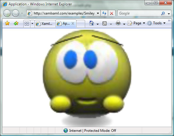
In the Channel 9 video, Kevin Moore and Robby Ingebretsen create a new button template that animates a button using a grid, some rectangles and a few images. Check out the video. I was unable to find the source code for their example so I quickly created a similar SmileyButton xbap example for everyone to peruse. Just click on the picture below to run the xbap app. This does exactly the same thing as the KevinButton, but using different images. The smiley will animate according to which part of the button the mouse is over. This has been built using the July CTP.
If you haven't had a chance to watch the video, the important thing to note about this example is that the single control in the application is a button: it captures and hooks into all the events and methods that a standard button inherits. It just has its presentation changed to be something other than the default.
The xaml source code for this WPF example can be found in the next post.


